Table of contentsClick link to navigate to the desired location
Manga Begins with PaperPencil: The Place Where the Page Can Still ChangeDip Pen: A Pen That Needs to be Dipped in InkG-Pen, Maru Pen, and Kabura: Why One Pen is Not EnoughInk: A Black Color That MattersBrushes, White Ink, and CorrectionsScreen Tones: Gray Without PaintRulers, Templates, and Knives: The Invisible Engineering of the PageAnime Begins Not with Movement, But with PlanningAnimation Paper and Peg BarLight Table: Seeing Previous Movement Through the Paper
This content has been automatically translated from Ukrainian.
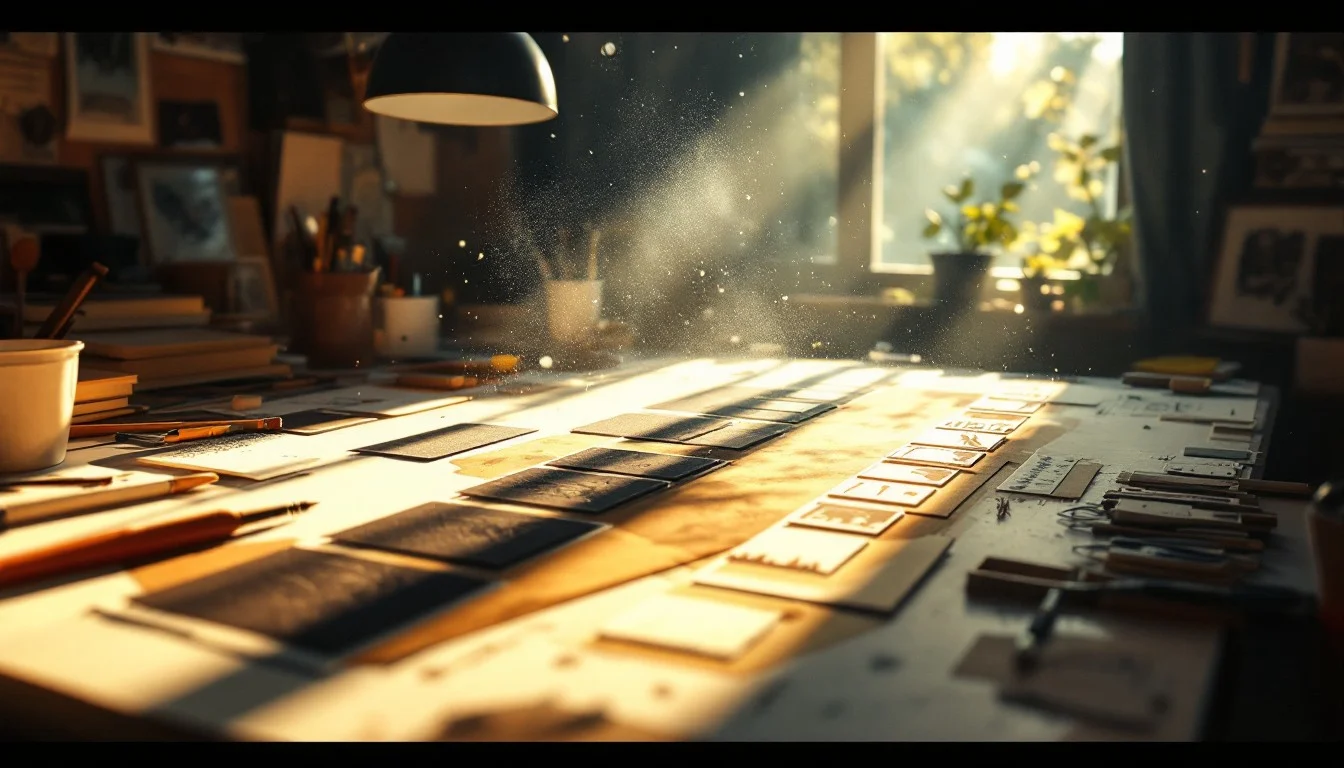
When talking about manga and anime, the style is most often mentioned: large eyes, dynamic angles, dramatic shadows, attention to movement and pauses. But behind this style lies not only the artist's imagination but also a very specific set of tools. Paper, ink, pens, screen tones, light tables, transparent animation sheets, paints, peg bars, and exposure sheets shaped how Japanese graphics looked before the digital age. They influenced the pace of work, the character of the line, the organization of production, and how the viewer perceived movement.
Manga Begins with Paper
Manga paper seems to be the simplest part of the process, but it sets many rules. For original pages, thicker paper is used, which withstands ink, erasing pencil marks, sticking screen tones, and multiple corrections. Professional manga paper often has service frames: the page border, a safe zone for important details, and an outer zone for trimming.
This is important because manga is created not as a separate beautiful picture but as a future printed page. The artist must know where the sheet will end after printing, where important text cannot be placed, how the panel will look in a magazine or volume. Therefore, even a clean white sheet in a manga workshop already has technical limitations for the future publication.
Pencil: The Place Where the Page Can Still Change
Before the ink, there is almost always a pencil. It outlines the composition, the positions of the characters, the direction of their gaze, the balance of black and white, and the placement of dialogue. At this stage, the page is still easy to change: the panel can be expanded, a gesture can be made sharper, a character can be moved closer to the foreground, and unnecessary details can be erased.
In the process of creating manga, the pencil often does not need to be beautiful in itself. Its task is to be clear for the next stage. If the author inks the page themselves, the pencil can be loose and quick. If assistants help with the work, the sketch must become a more precise instruction: where the contour line is, where the shadow is, where the background is, and where to leave space for the screen tone.
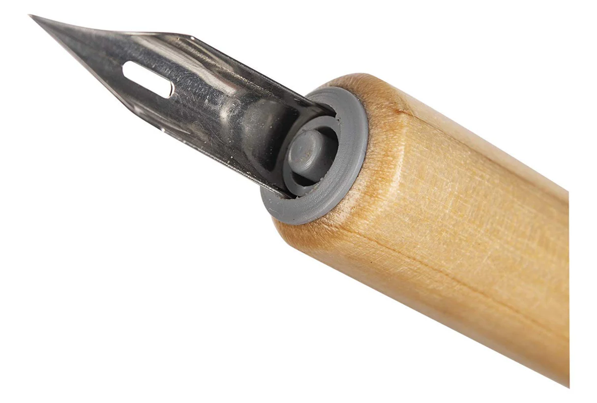
Dip Pen: A Pen That Needs to be Dipped in Ink
One of the most characteristic tools of manga is the dip pen. The English term dip pen refers to a pen that is dipped in ink or liquid ink. In the Japanese context, the word tsuke-pen — つけペン is often used. This is not a fountain pen with a reservoir, nor a liner with a fixed thickness. A dip pen consists of a holder and a replaceable metal nib. The artist dips the nib in ink, draws a line, dips it again, and continues working.
At first glance, this seems inconvenient, but the dip pen responds well to pressure: the line can be thin and barely noticeable, and in a moment become thicker and more tense. The contour of a face, the fold of fabric, a strand of hair, a quick hand movement — all of this can be done not with a uniform mechanical line but variably — with a noticeable change in thickness.
This is particularly important for manga. A black-and-white page largely relies on the rhythm of lines: thin lines leave more visual lightness, thick ones highlight objects, sharp ones enhance tension, and broken lines convey nervousness or quick movement. That is why the classic ink pen has long been one of the basic tools of manga artists.
G-Pen, Maru Pen, and Kabura: Why One Pen is Not Enough
In manga tools, the G-pen is often mentioned. This is a soft pen that changes the thickness of the line well depending on the pressure. It is loved for its expressiveness: it can create a strong contour, make a dramatic stroke, emphasize movement or the weight of a figure. The G-pen is not always obedient for beginners, but in an experienced hand, it provides a flexible and expressive line.
Maru Pen or 丸ペン — is thinner and more delicate. It is often used for small details: hair, eyelashes, fabric textures, complex backgrounds, small decorative elements. Unlike the G-pen, it gives a very thin and controlled line.
Kabura Pen or spoon pen has a firmer stroke. It provides a more stable line, less sensitive to pressure. This tool is useful where precision and control are needed: even contours, less dramatic graphics, text or decorative elements. There are also school pens and other options, but the principle is the same: different pens exist not for collection but for different types of lines.
Therefore, the choice of pen affects not only the technique but also the impression of the page. One scene can look softer, sharper, or more detailed depending on the line used to execute it.
Ink: A Black Color That Matters
Ink in manga must be dense, dark enough, and resistant after drying. It should provide a clean contour, not bleed on the paper, and not disappear after erasing pencil marks. Black in manga is not just a color but one of the main ways to control the tone of the scene.
Large black spots can denote night, strong shadow, enclosed space, or a tense pause. A dry line is suitable for dust, old surfaces, or a tense texture. A flat fill works differently than a broken stroke, so ink in manga is used not only for contours but also for building the mood of the scene.
Brushes, White Ink, and Corrections
Despite the importance of the pen, manga is not drawn with it alone. Brushes are needed for large black areas, soft shadows, expressive strokes, or effects that are difficult to achieve with a pen. They provide a wider stroke and are better suited for large fills.
White paint or white ink is used separately. It corrects mistakes, removes excess, adds shine to the eyes, light to the hair, sparks, snow, splashes, and small effects. In black-and-white graphics, white works as an active material: it returns light, clarifies shape, and helps emphasize details.
Screen Tones: Gray Without Paint
Manga was traditionally printed mainly in black and white, but it needed shadows, halftones, textures, and atmosphere. This is where screen tones come in — transparent or semi-transparent adhesive films with printed dots, lines, gradients, patterns, or textures.
The artist would stick the screen tone onto the desired area of the page, press it down, and then carefully cut away the excess with a knife. This allowed for creating a gray shadow on a face, a metallic shine, fog, sky, fabric, a concrete wall, or an emotional background behind a character. Screen tones saved time but required precision. One wrong move with the blade — and the page could be scratched.
In old manga, screen tones often immediately set the type of scene. Dense dots make the image darker and heavier. A light tone leaves more light. Radial lines enhance sharp movement or emotional reaction. A floral or shiny background can shift the scene into a romantic, comedic, or ironic mode.
Rulers, Templates, and Knives: The Invisible Engineering of the Page
Manga seems emotional, but its page is very engineered. Rulers are needed for panels. For speed lines — long, straight hand movements. For urban backgrounds — perspective, vanishing points, architectural logic. For circles, techniques, and mechanisms — templates, compasses, stencils.
A utility knife in this world is no less important than a pen: it cuts screen tones, removes excess pieces, and trims edges. Tweezers help work with small fragments of film. An eraser must erase pencil marks but not damage the ink. All these small things are not visible to the reader, but they make the page clean.
Anime Begins Not with Movement, But with Planning
Traditional anime is not just a lot of drawings in sequence. Before drawing movement, there is a script, storyboarding, character design, model sheets, backgrounds, and timing. Storyboarding is similar to a comic but works with time: where the camera is positioned, how long a pause lasts, when a character turns their head, how one shot transitions to the next.
Model sheets show what a character should look like from different angles, in different emotions and poses. This is necessary so that dozens of people can draw one hero recognizably. Without such sheets, a character would slightly change in each scene: different eyes, a different nose, a different hair shape. In animation, this is immediately noticeable.
Animation Paper and Peg Bar
Classic animation drawings are made on special paper with holes. These holes fit onto a peg bar — a bar with pegs that holds the sheets in the same position. This may seem trivial, but without it, the movement would start to shake.
When an animator draws frame by frame, they need the character not to jump around the sheet randomly. The peg bar secures the paper and reduces the risk of unwanted shifting. If a character's hand moves, only the hand moves, not the entire drawing due to paper displacement. For professional animation, such precision is critically important.
Light Table: Seeing Previous Movement Through the Paper
A light table or lightbox is another basic tool of traditional animation. It is a surface with even backlighting from below. The animator places several sheets on top of each other and sees the previous and next positions through the paper. This allows for drawing an in-between frame between two key poses.
In digital programs, there is onion skin, but its logic comes from here: the artist sees the adjacent phases of movement semi-transparently and can place the in-between frame more accurately. The light table clearly shows that animation consists not of separate poses but of a sequential change between them. A hand rises convincingly only when there are thoughtful transitions between the lower and upper positions.
## Key Frames, In-Between Frames, and Clean Line
In traditional animation, not every drawing is equally important. First, the key animator defines the main positions of the scene: the character sits, looks up, suddenly stands up, freezes. These are the key frames. Then other artists or assistants add in-between frames to make the movement smooth or, conversely, to maintain the desired abruptness.
After this, the drawing undergoes clean-up — a clean redraw. The rough sketch may have many exploratory lines, corrections, and constructions. Clean-up leaves only what should go further: a clear contour, correct details, and adherence to the character model. This is not a mechanical tracing. A good clean-up retains the energy of the rough draft but removes the chaos.
## Exposure Sheet: A Table That Controls Time
One of the least noticeable but very important tools of animation is the **exposure sheet**, or X-sheet. This is a table that indicates which drawing appears for how many frames, where a line of dialogue occurs, when movement happens, where a pause is needed, and when a layer or background changes.
For the viewer, anime is an emotion. For production, it is precise timing mathematics. If a new drawing is needed for each frame, the movement can be very smooth, but the work becomes more expensive and slower. If one drawing holds for two or three frames, the movement becomes less smooth, but production saves time and can consciously emphasize a pause or abruptness. In anime, a combination of different timings is often used: somewhere the movement is very smooth, somewhere the character is almost still, but the camera, background, hair, or effect maintain the sense of movement in the shot.
## Cel Sheets: Transparent Layers of Anime
When talking about old anime, the term **cel animation** is often mentioned — animation on transparent sheets, which can be described in Ukrainian as cel sheets or animation transparent sheets. The name comes from celluloid, but at various times, not only celluloid was used, but also safer acetate or polyester materials. On such a transparent sheet, the character's contour was transferred, and paint was applied from the back.
Why was this necessary? To avoid redrawing everything from scratch. The background could remain a separate painted work, while the character moved on a transparent layer above it. If only the mouth is speaking in a scene, there is no need to repaint the entire room. If a character blinks, only the necessary layer can be changed.
Because of this, old anime frames have a special materiality. The character and background sometimes noticeably differ in execution: the background is painterly, soft, textured; the character is clearer, outlined, flatter in color. This difference has become part of the aesthetic.
## Paints for Cel Sheets and Backgrounds in Gouache
Cel sheets were painted from the back so that the front remained a clean contour and brush strokes were not visible. For this, special paints for cel animation were used: they had to cover the transparent base densely, dry evenly, and look stable under the camera.
Backgrounds were created separately. They were painted on paper or cardboard with gouache, watercolor, acrylic, sometimes with very fine work with light. Backgrounds often set the atmosphere: a hot street, a quiet kitchen, a damp forest, an evening city, a classroom after lessons. In good anime, the background does not just fill the space. It helps to understand the mood of the scene before the character says anything.
## Rostrums and Multi-Plane Shooting
When the frame was ready, the layers were placed under a special camera. The background could be at the bottom, above it — one or several transparent cel sheets with characters, effects, and objects. Glass pressed the materials down to keep them flat. The camera photographed the frame. Then one layer was changed or slightly shifted, and the process was repeated.
For more complex effects, multi-plane shooting was used: different layers were placed at different distances from the camera. When they were moved at different speeds, a sense of depth was created. The foreground could move faster, the background slower. This way, the two-dimensional image gained space.
In Japanese animation, this layer logic became very important even when production had partially transitioned to new technologies. A frame is often built from several separate elements: character, background, shadow, light, effect, camera movement, pause.
## Film, Dust, and Mistakes That Became Part of the Image
Non-digital tools have one interesting feature: they leave traces. Ink can slightly change the thickness of the line. Paint on a cel sheet may not lay down perfectly. There may be dust on the film. A layer can cast a barely noticeable shadow. The background may have the texture of paper.
From a production standpoint, this is often a problem, but in the finished work, such small traces can add a sense of materiality. Old manga pages and cel animation do not look sterile: they show manual work, the properties of materials, and the sequence of production stages. A frame did not appear instantly: it was held, cut, painted, dried, transferred, and photographed.
## Why These Tools Are Still Important
Today, manga and anime are often created digitally, but old tools have not just become museum pieces. Many artists still work with pen and ink or at least study this logic. The reason is simple: a material tool teaches decisiveness. An ink line cannot be endlessly undone. A screen tone must be cut carefully. An animation sheet must be placed precisely. Working with a brush is harder to correct after a failed stroke.
This does not mean that analog is better than digital. It simply shapes thinking differently. A dip pen teaches one to feel pressure. A light table — to see movement between poses. A peg bar — to work with precise alignment of sheets. An exposure sheet — to plan timing. A cel sheet — to think in layers. A screen tone — to build tone not with color but with texture.
## Conclusion
Manga tools and anime tools are not minor technical details for fans. They explain why pages and frames look the way they do. The dip pen shows where the variable line in manga comes from. The screen tone explains how halftones were created in black-and-white printing. The light table shows the mechanics of movement. The cel sheet reminds us that anime was long created through transparent layers, paint, and sequential photographing of frames.
When you know these tools, manga and anime are read and watched differently. You start to notice not only the plot or characters but also specific techniques: where the line is pressed harder, where the shadow is applied with a screen tone, where the background is painted with a brush, where the movement is held on a few very precisely chosen frames. Thus, the graphics become clearer not only as a style but also as a result of manual labor.
Like it?React
🧵
This post doesn't have any additions from the author yet.